Cisco Opportunities Dashboard
The Goal:
Launch an online learning platform to support schools in promoting emotional intelligence and improving social climates.
Launch an online learning platform to support schools in promoting emotional intelligence and improving social climates.
The Team:
I was Product Researcher, Strategist, and Lead Designer, working with a Senior UX/UI Designer, two Staff UX/UI Designers, and a couple of animators to put together our prototype videos.
I was Product Researcher, Strategist, and Lead Designer, working with a Senior UX/UI Designer, two Staff UX/UI Designers, and a couple of animators to put together our prototype videos.
Results:
While working for the design consultancy Intelligaia, I was involved in a handful of projects for our primary client at the time, Cisco. We collaborated most frequently with the Commerce Workspace team, for whom we developed an extensive business intelligence concept called Opportunities Dashboard. During the two years I was involved in this project, the first year was about selling the concept to Cisco stakeholders (which we did, beating out several competitors).
While working for the design consultancy Intelligaia, I was involved in a handful of projects for our primary client at the time, Cisco. We collaborated most frequently with the Commerce Workspace team, for whom we developed an extensive business intelligence concept called Opportunities Dashboard. During the two years I was involved in this project, the first year was about selling the concept to Cisco stakeholders (which we did, beating out several competitors).
Discovery + Definition:
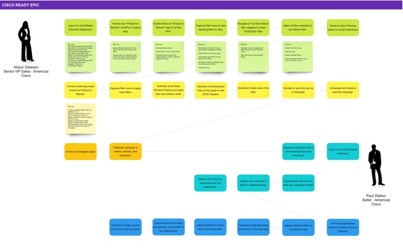
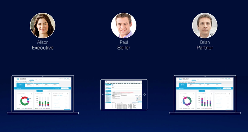
The vision for this dashboard evolved over time, expanding its reach to serve various personas across all levels of the sales organization. Originally, the dashboard would help sellers identify previously-missed opportunities as well as allow for faster generation of quotes.
Through our discovery work, we quickly realized that the dashboard would have a bigger impact if it allowed for a tighter-knit collaboration between executives, who would identify and generate sales campaigns, and the sellers who would be responsible for executing them.
In addition, I helped script and produce a video to help sell this new vision for the product to stakeholders.
Early study of collaboration between sales leadership and sellers.

Detail from proposal to client stakeholders on how to ease the path to success for sellers.
Video still from start-to-finish proposal.
Dashboard Design:
Once we had developed more extensive journey maps and understood handovers between personas, I proceeded to gather information about existing categories of sales data relevant to each.
We tested various concepts with paper prototypes and gathered extensive feedback from stakeholders on various visual design approaches. We sought to find the correct balance of graphical data, high-level KPIs, and most importantly, powerful filtering capabilities that would illuminate important insights in the data.
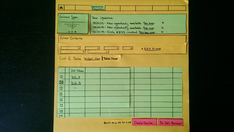
Paper prototyping with moveable components used for in-person meetings with stakeholders.
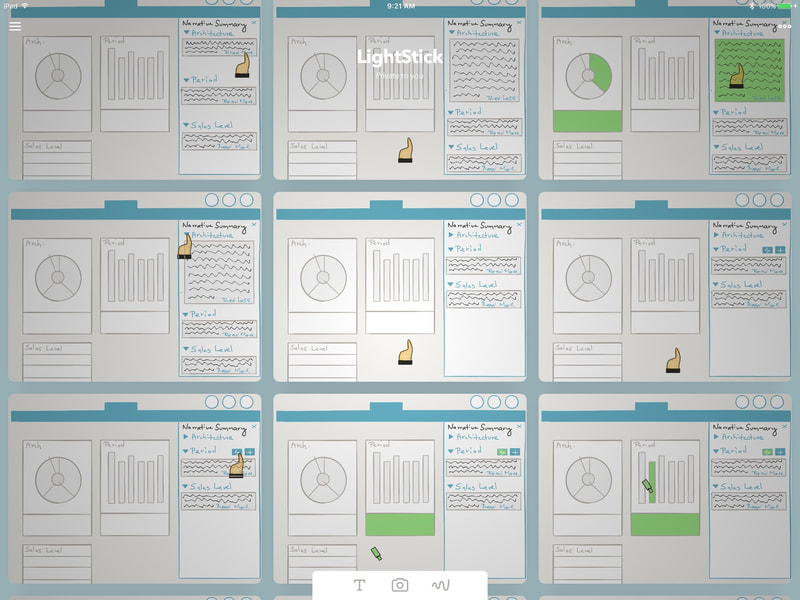
Digital sketching for interaction design explorations.
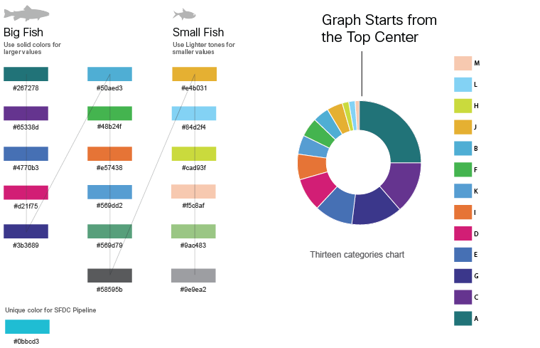
Big Fish / Little Fish: Creating a color system for data visualizations with multiple categories.
Testing different components that would need to co-exist on the dashboard.
Dashboard Design (continued):
Due to the high number of data categories that needed to be represented graphically, we had to come up with a color system that extended the one featured in Cisco’s design system guidelines.
We nicknamed our approach Big Fish/Little Fish. This responsive color palette helped users identify opportunities and insights in the data no matter how big or small they were (there was value in being able to combine a multitude of smaller opportunities into one campaign).
Although our focus at first was to figure out the color palette and sequencing, our team continued to develop rules around spacing of values based on their relative size.
With stakeholder confidence in our visual approach, we were also asked to provide mobile-friendly designs to guide the engineering team make the dashboard responsive.
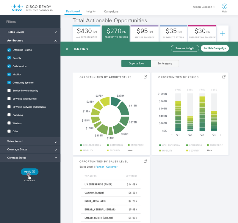
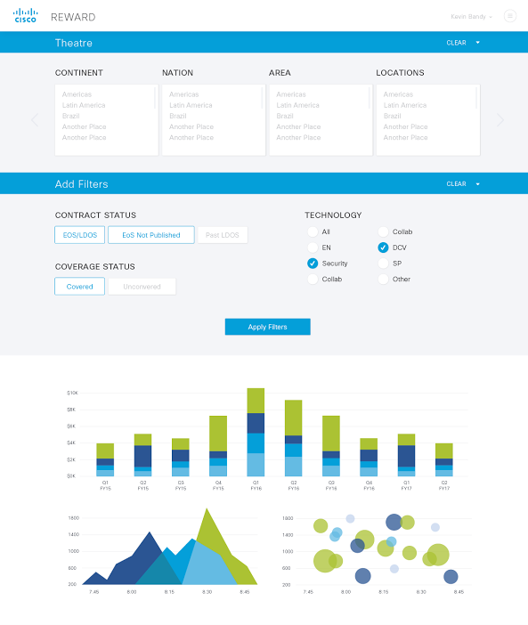
High-fidelity concept, highlighting the extensive filter menu.
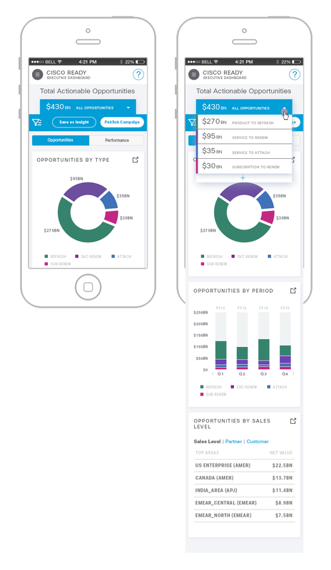
Mobile version.